Theming Default Hosted pages
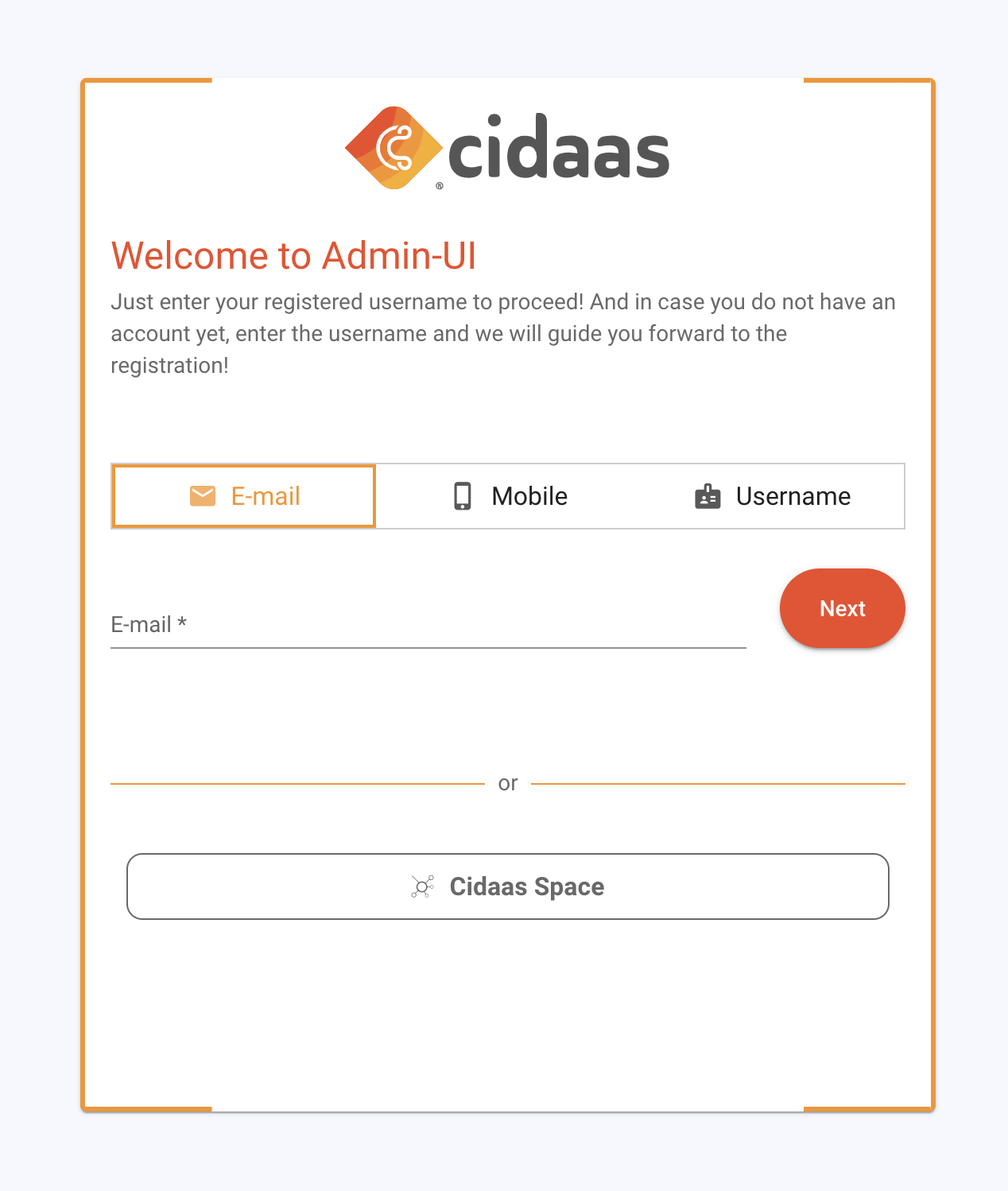
Theming is an essential design strategy for hosted pages like login, registration, and profile pages, which are key touchpoints in user interactions. By implementing a cohesive theme, organizations can strengthen their visual identity, ensuring that every page feels secure, trustworthy, and familiar to users.
Motivation
Brand Recognition
Consistent theming across pages makes a brand instantly recognizable. Users feel more comfortable and secure when they see familiar colors, fonts, and logos, which is especially important on login and registration pages where trust is key.
User Experience (UX)
A unified theme improves usability by reducing cognitive load. Familiar design elements help users intuitively navigate and interact with pages, creating a seamless and predictable journey through the site.
Customizability and Flexibility
A well-structured theme allows for easy updates without requiring a complete redesign. Changes to brand colors, typography, or other design elements can be applied across all themed pages effortlessly. For example, a change in brand colors or typography can be applied easily across the theme, instantly updating all themed pages.
Reinforcing Brand Values
Theming offers an opportunity to communicate brand values through design elements. A brand that values simplicity, for instance, can opt for a minimalist theme with ample white space, whereas a brand focused on creativity may choose vibrant colors and dynamic visuals.
To give you an easy start with our default hosted pages, the theming feature will support you
Theming Options: Flexibility to Customize the Default Hosted Pages
These properties follow a consistent naming convention prefixed with --cid-, which stands for Custom Interface Design. They are designed to support a flexible, responsive, and themeable UI system.
Each variable plays a role in customizing the visual appearance of the user interface across different devices (mobile, tablet, desktop). These variables control key design aspects such as typography, color schemes, spacing, layout boundaries, and visual effects like shadows and borders.
By using these CSS variables:
- You ensure consistency across components and pages.
- You enable easy theming by changing a few central values.
- You support responsive design by tailoring values per device type.
- You improve maintainability and scalability of the codebase.
The documentation is organized into categories (e.g., Typography, Headings, Boundary Box, etc.), with each section detailing the purpose and usage of specific variables. Where applicable, variables are listed per device breakpoint to help you fine-tune the appearance of your application on various screen sizes.
📚 Typography
Font Family
Defines the primary font used throughout the UI.
| Variable | Description |
|---|---|
--cid-font-family | Base font family used throughout the application. |
Base Font Size
Controls the root font size based on the device type.
| Device | Variable | Description |
|---|---|---|
| Mobile | --cid-base-font-size-mobile | Base font size for mobile devices. |
| Tablet | --cid-base-font-size-tablet | Base font size for tablets. |
| Desktop | --cid-base-font-size-desktop | Base font size for desktops. |
Base Font Color
Sets the base text color for different screen sizes.
| Device | Variable | Description |
|---|---|---|
| Mobile | --cid-base-font-color-mobile | Text color on mobile devices. |
| Tablet | --cid-base-font-color-tablet | Text color on tablets. |
| Desktop | --cid-base-font-color-desktop | Text color on desktops. |
🧩 Headings
Font Size
Specifies the font size for headings across devices.
| Device | Variable | Description |
|---|---|---|
| Mobile | --cid-font-size-heading-mobile | Heading font size on mobile. |
| Tablet | --cid-font-size-heading-tablet | Heading font size on tablet. |
| Desktop | --cid-font-size-heading-desktop | Heading font size on desktop. |
Margin
Controls the space around headings
| Device | Variable | Description |
|---|---|---|
| Mobile | --cid-margin-heading-mobile | Heading margin on mobile. |
| Tablet | --cid-margin-heading-tablet | Heading margin on tablet. |
| Desktop | --cid-margin-heading-desktop | Heading margin on desktop. |
Color
Controls the text color of headings.
| Device | Variable | Description |
|---|---|---|
| Mobile | --cid-color-heading-mobile | Heading color on mobile. |
| Tablet | --cid-color-heading-tablet | Heading color on tablet. |
| Desktop | --cid-color-heading-desktop | Heading color on desktop. |
🧩 Sub-headings
Font Size
Specifies the font size for sub-headings across devices.
| Device | Variable | Description |
|---|---|---|
| Mobile | --cid-font-size-sub-heading-mobile | Sub-heading font size on mobile. |
| Tablet | --cid-font-size-sub-heading-tablet | Sub-heading font size on tablet. |
| Desktop | --cid-font-size-sub-heading-desktop | Sub-heading font size on desktop. |
Margin
Controls the space around sub-headings across devices.
| Device | Variable | Description |
|---|---|---|
| Mobile | --cid-margin-sub-heading-mobile | Sub-heading margin on mobile. |
| Tablet | --cid-margin-sub-heading-tablet | Sub-heading margin on tablet. |
| Desktop | --cid-margin-sub-heading-desktop | Sub-heading margin on desktop. |
Color
Controls the text color of headings or sub-headings.
| Device | Variable | Description |
|---|---|---|
| Mobile | --cid-color-sub-heading-mobile | Sub-heading color on mobile. |
| Tablet | --cid-color-sub-heading-tablet | Sub-heading color on tablet. |
| Desktop | --cid-color-sub-heading-desktop | Sub-heading color on desktop. |
Boundary Box
Width
Determines the width of the boundary box depending on device.
| Device | Variable | Description |
|---|---|---|
| Mobile | --cid-boundary-box-width-mobile | Box width on mobile. |
| Tablet | --cid-boundary-box-width-tablet | Box width on tablet. |
| Desktop | --cid-boundary-box-width-desktop | Box width on desktop. |
Padding
Sets the internal spacing within the boundary box.
| Device | Variable | Description |
|---|---|---|
| Mobile | --cid-boundary-box-padding-mobile | Padding inside box (mobile). |
| Tablet | --cid-boundary-box-padding-tablet | Padding inside box (tablet). |
| Desktop | --cid-boundary-box-padding-desktop | Padding inside box (desktop). |
Border Width
Specifies the thickness of the boundary box border.
| Device | Variable | Description |
|---|---|---|
| Mobile | --cid-boundary-box-border-width-mobile | Border width (mobile). |
| Tablet | --cid-boundary-box-border-width-tablet | Border width (tablet). |
| Desktop | --cid-boundary-box-border-width-desktop | Border width (desktop). |
Border Gap
Defines the space between the borders on top and bottom.
| Device | Variable | Description |
|---|---|---|
| Mobile | --cid-boundary-box-border-gap-mobile | Border gap (mobile). |
| Tablet | --cid-boundary-box-border-gap-tablet | Border gap (tablet). |
| Desktop | --cid-boundary-box-border-gap-desktop | Border gap (desktop). |
Border Color
Controls the color of the boundary box border for different devices.
| Device | Variable | Description |
|---|---|---|
| Mobile | --cid-boundary-box-border-color-mobile | Border color (mobile). |
| Tablet | --cid-boundary-box-border-color-tablet | Border color (tablet). |
| Desktop | --cid-boundary-box-border-color-desktop | Border color (desktop). |
Background
Applies background color to boundary boxes.
| Device | Variable | Description |
|---|---|---|
| Mobile | --cid-boundary-box-background-mobile | Background (mobile). |
| Tablet | --cid-boundary-box-background-tablet | Background (tablet). |
| Desktop | --cid-boundary-box-background-desktop | Background (desktop). |
Shadow
Adds shadow effects to the boundary box for depth.
| Device | Variable | Description |
|---|---|---|
| Tablet | --cid-boundary-box-shadow-tablet | Shadow style (tablet). |
| Desktop | --cid-boundary-box-shadow-desktop | Shadow style (desktop). |
🖼️ Background Image
Position
Specifies the placement of background images.
| Device | Variable | Description |
|---|---|---|
| Tablet | --cid-bg-image-position-tablet | Background image alignment on tablet. |
| Desktop | --cid-bg-image-position-desktop | Background image alignment on desktop. |
Rounded
Indicates if the background image should have rounded corners.
| Variable | Description |
|---|---|
--cid-bg-image-rounded | Whether the image has rounded borders. |
Box Shadow
Applies a shadow to background images for visual layering.
| Variable | Description |
|---|---|
--cid-bg-image-box-shadow-desktop | Box shadow for image on desktop. |
Border
Defines the border applied to background images.
| Variable | Description |
|---|---|
--cid-bg-image-border-desktop | Image border on desktop. |
Border Radius
Specifies how rounded the corners of the image are.
| Variable | Description |
|---|---|
--cid-bg-image-border-radius-desktop | Border radius of image on desktop. |
Margin
Controls the space around background images.
| Variable | Description |
|---|---|
--cid-bg-image-margin-desktop | Margin around image on desktop. |
🖌️ Miscellaneous
Logo Height
Sets the logo's height per device breakpoint.
| Device | Variable | Description |
|---|---|---|
| Mobile | --cid-logo-height-mobile | Logo height on mobile. |
| Tablet | --cid-logo-height-tablet | Logo height on tablet. |
| Desktop | --cid-logo-height-desktop | Logo height on desktop. |
Button Border Radius
Determines how rounded the buttons appear.
| Device | Variable | Description |
|---|---|---|
| Mobile | --cid-button-border-radius-mobile | Border radius on buttons (mobile). |
| Tablet | --cid-button-border-radius-tablet | Border radius on buttons (tablet). |
| Desktop | --cid-button-border-radius-desktop | Border radius on buttons (desktop). |
Background Color
Controls the overall page background color.
| Device | Variable | Description |
|---|---|---|
| Mobile | --cid-background-color-mobile | Page background color on mobile. |
| Tablet | --cid-background-color-tablet | Page background color on tablet. |
| Desktop | --cid-background-color-desktop | Page background color on desktop. |
Apply Your Theme in Apps
Theming allows you to style multiple elements consistently across different pages, such as the login, registration, and progressive profiling pages.
Each theme defines styling elements, which collectively create a unified visual experience:
A theme includes settings for:
Color Palette
Includes primary and accent colors that reflect the brand’s identity, providing a cohesive look across all pages.
Typography
Specifies fonts, sizes, and text styles, ensuring text readability and stylistic consistency.
Button and Input Styles
Standardizes button shapes, hover effects, and input fields, making interactions predictable and reinforcing a professional look.
Spacing, Borders, and Layout:
Defines padding, margins, and alignment, creating an organized structure and ensuring a uniform page layout.
How it would look
Here are some elegant design examples with their respective code for your new theming style. There are many more for you to explore.
Borderless Bliss
:root{
    --cid-boundary-box-border-width-mobile: 0;
    --cid-boundary-box-border-width-tablet: 0;
    --cid-boundary-box-border-width-desktop: 0;
}

Framed Elegance
:root{
    --cid-boundary-box-border-width-mobile: 3px;
    --cid-boundary-box-border-width-tablet: 3px;
    --cid-boundary-box-border-width-desktop: 3px;
}
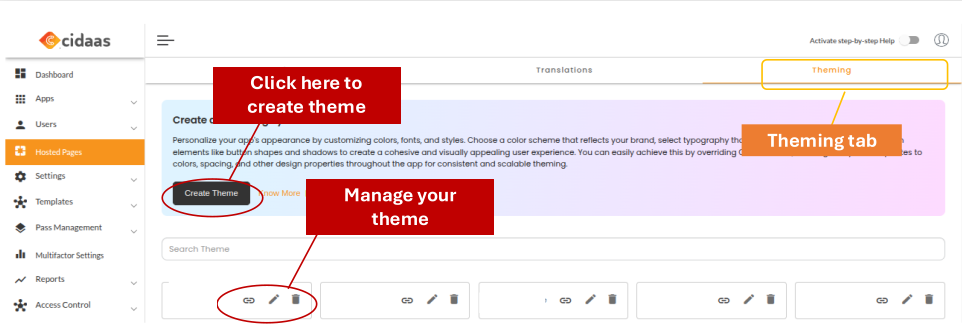
Create new Hosted pages themes
-
Log in to the cidaas admin dashboard
-
Click on the Hosted pages > Theming > Create theme.
-
Edit the required changes (code) that you need on the right editing screen with a suitable custom name.
-
Click on Save.
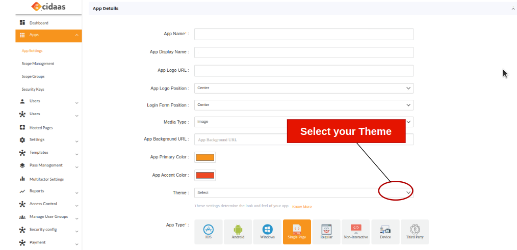
Mapping themes to the App
How to create a new app
- Go to the Apps > App settings.
-
Search for your desired app that you want to map and click on the edit icon.
-
Select App details > select the theme.
-
Your theme is mapped to the App.
This flow allows managing themes for customization purposes. The APIs enable retrieving available themes, accessing specific theme files, and uploading new themes to customize the look and feel of hosted pages.
| API | Description | Link |
|---|---|---|
| Retrieve All Available Themes | This API is used to display or manage available themes in an interface or configuration page | Link |
| Retrieve a Specific Theme by Filename | This endpoint retrieves a specific theme file by filename, allowing direct access to a particular theme file | Link |
| Upload a New Theme | This API is used for dynamically updating or adding new custom themes by uploading CSS files to the server. | Link |
Please contact us directly on our support page or reach out to cidaas support at [email protected].